The Referral Screen
A freelance visual design project for Rivet, a dating app looking to expand their referral system into three distinct invite flows. No design system, no brand kit, no existing Figma file, just their live product and public brand assets to work from, and full ownership over the direction.
Year
2026
Scope
Visual Design & Product Design
Client
Rivet Dating
Duration
1 Week
VIEW PROTOTYPE
THE PROBLEM
Rivet came to me wanting three invite flows, one where a friend judges your matches for you, one where a friend joins and dates on their own, and one general, no-strings-attached invite. Two of the three had fixed karma rewards already decided. The third was left open, mine to define and justify.
The real problem wasn't any single screen. It was that three genuinely different asks needed to read as one product. Designed too similarly, the purposes blur together. Designed too differently, it stops feeling like Rivet.
There was no design system to lean on either. When I asked for one, the answer was direct, that was intentional. Type, colour, and components were mine to own.
WHAT I DID
I reverse-engineered Rivet's visual language from what already existed, their live App Store screenshots and public brand assets. That gave me real colours, their script wordmark, and UI patterns I could carry forward directly, including a judgement-score slider already sitting inside their product.
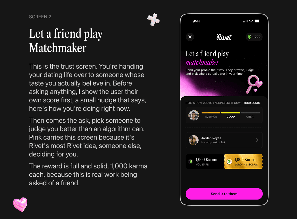
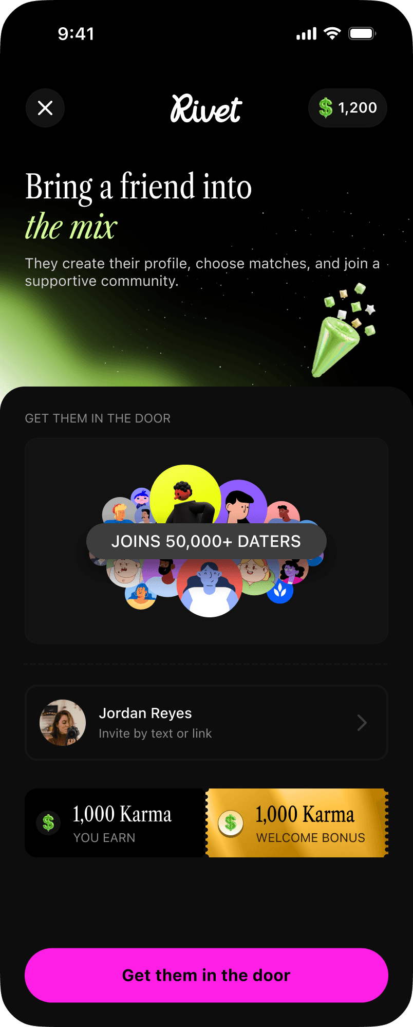
From there I designed four screens. A hub screen where a user picks their reason, and three invite screens beneath it, one for matchmaking, one for joining and dating, one lightweight general invite. Same friend, three different reasons to hit send.
THE DECISIONS THAT MATTERED
One color, one job, per screen
Each invite type owns exactly one color and nothing else does. Pink carries the matchmaker invite, since handing your dating life to someone you trust is Rivet's most Rivet idea. Green carries the join and date invite, since that's a belonging story, not a romance one, and shouldn't share a color with the screen before it. The general invite owns no color at all, on purpose. A screen asking for nothing shouldn't try to look like it's asking for something.
Keeping four screens as one system
Color and content change screen to screen. Nothing else does. Same top bar, same wordmark placement, same karma strip, same button shape, same spacing throughout. Placed side by side, the four screens read as one flow before a single word gets read.
Making karma mean one thing
Karma only ever shows up as value earned, never as decoration. The two purpose-driven invites both pay 1,000 karma to each side, since both require real effort, properly judging a profile or building one. The general invite pays less, and that's where the open decision actually lived.
The judgement call
Paying the general invite the full 1,000 karma felt wrong, it asks for a tap, not real work. Paying it nothing felt worse, it would've made the screen feel like an afterthought instead of a real third option. I split it, 250 karma upfront, 750 more once the friend actually picks a path inside the app. The math always lands on the same 1,000 as the other two screens, just paid out in two parts. That also answers how the screen relates to the other two, it isn't competing with them, it's the front door into them.
HOW IT SHIPPED
Four high-fidelity mobile screens, a working Figma prototype, and a written rationale covering differentiation, system coherence, the karma treatment, and the tradeoff above, delivered to spec and on schedule.
What I'd do differently: I'd stress-test the karma split with real numbers before locking it in. 250 and 750 felt right by instinct, but a system this tied to user behavior deserves actual modelling, not just a decision that happens to add up cleanly on a slide.